Choosing the right format

© iStockphoto
"A picture is worth a thousand words." This is certainly true when you're presenting and explaining data. You can provide tables setting out the figures, and you can talk about numbers, percentages, and relationships forever. However, the chances are that your point will be lost if you rely on these alone. Put up a graph or a chart, and suddenly everything you're saying makes sense!
Graphs or charts help people understand data quickly. Whether you want to make a comparison, show a relationship, or highlight a trend, they help your audience "see" what you are talking about.
The trouble is there are so many different types of charts and graphs that it's difficult to know which one to choose. Click on the chart option in your spreadsheet program and you're presented with many styles. They all look smart, but which one is appropriate for the data you've collected?
Can you use a bar graph to show a trend? Is a line graph appropriate for sales data? When do you use a pie chart? The spreadsheet will chart anything you tell it to, whether the end result makes sense or not. It just takes its orders and executes them!
To figure out what orders to give, you need to have a good understanding of the mechanics of charts, graphs and diagrams. We'll show you the basics using four very common graph types:
- Line graph
- Bar graph
- Pie chart
- Venn diagram
First we'll start with some basics.
X and Y Axes – Which is Which?
To create most charts or graphs, excluding pie charts, you typically use data that is plotted in two dimensions, as shown in Figure 1.
- The horizontal dimension is the x-axis.
- The vertical dimension is the y-axis.
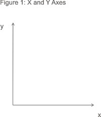
To remember which axis is which, think of the x-axis as going along the corridor and the y-axis as going up the stairs. The letter "a" comes before "u" in the alphabet just as "x" comes before "y".
When you come to plot data, the known value goes on the x-axis and the measured (or "unknown") value on the y-axis. For example, if you were to plot the measured average temperature for a number of months, you'd set up axes as shown in Figure 2:

The next issue you face is deciding what type of graph to use.
Line Graphs
One of the most common graphs you will encounter is a line graph. Line graphs simply use a line to connect the data points that you plot. They are most useful for showing trends, and for identifying whether two variables relate to (or "correlate with") one another.
Trend data:
- How do sales vary from month to month?
- How does engine performance change as its temperature increases?
Correlation:
- On average, how much sleep do people get, based on their age?
- Does the distance a child lives from school affect how frequently he or she is late?
You can only use line graphs when the variable plotted along the x-axis is continuous – for example, time, temperature or distance.
Note:
When the y-axis indicates a quantity or percent and the x-axis represents units of time, the line graph is often referred to as a time series graph.
When the y-axis indicates a quantity or percent and the x-axis represents units of time, the line graph is often referred to as a time series graph.
Example:
ABC Enterprises' sales vary throughout the year. By plotting sales figures on a line graph, as shown in Figure 3 , it's easy to see the main fluctuations during the course of a year. Here, sales drop off during the summer months, and around New Year.
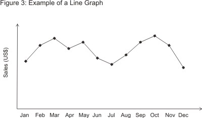
While some seasonal variation may be unavoidable in the line of business ABC Enterprises is in, it may be possible to boost cash flows during the low periods through marketing activity and special offers.
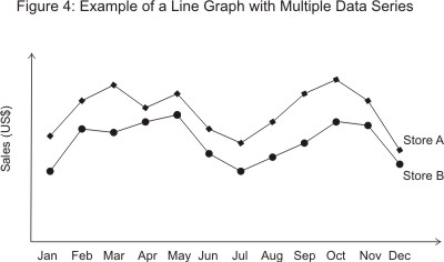
Line graphs can also depict multiple series. In this example you might have different trend lines for different product categories or store locations, as shown in Figure 4 below. It's easy to compare trends when they're represented on the same graph.
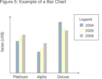
Bar Graphs
Another type of graph that shows relationships between different data series is the bar graph. Here the height of the bar represents the measured value or frequency: The higher or longer the bar, the greater the value.
Example:
ABC Enterprises sells three different models of its main product, the Alpha, the Platinum, and the Deluxe. By plotting the sales each model over a three year period, it becomes easy to see trends that might be masked by a simple analysis of the figures themselves. In Figure 5, you can see that, although the Deluxe is the highest-selling of the three, its sales have dropped off over the three year period, while sales of the other two have continued to grow. Perhaps the Deluxe is becoming outdated and needs to be replaced with a new model? Or perhaps it's suffering from stiffer competition than the other two?
Of course, you could also represent this data on a multiple series line graph as shown in Figure 6.
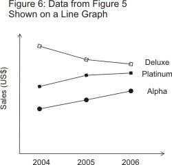
Often the choice comes down to how easy the trend is to spot. In this example the line graph actually works better than the bar graph, but this might not be the case if the chart had to show data for 20 models rather than just three. It's worth noting, though, that if you can use a line graph for your data you can often use a bar graph just as well.
The opposite is not always true. When your x-axis variables represent discontinuous data (such as different products or sales territories), you can only use a bar graph.
In general, line graphs are used to demonstrate data that is related on a continuous scale, whereas bar graphs are used to demonstrate discontinuous data.
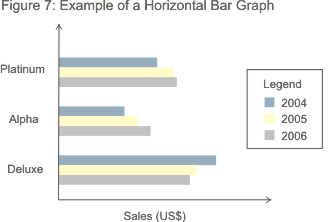
Data can also be represented on a horizontal bar graph as shown in Figure 7. This is often the preferred method when you need more room to describe the measured variable. It can be written on the side of the graph rather than squashed underneath the x-axis.
Note:
A bar graph is not the same as a histogram. On a histogram, the width of the bar varies according to the range of the x-axis variable (for example, 0-2, 3-10, 11-20, 20-40 and so on) and the area of the column indicates the frequency of the data. With a bar graph, it is only the height of the bar that matters.
A bar graph is not the same as a histogram. On a histogram, the width of the bar varies according to the range of the x-axis variable (for example, 0-2, 3-10, 11-20, 20-40 and so on) and the area of the column indicates the frequency of the data. With a bar graph, it is only the height of the bar that matters.
Pie Charts
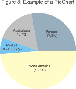
A pie chart compares parts to a whole. As such it shows a percentage distribution. The entire pie represents the total data set and each segment of the pie is a particular category within the whole.
So, to use a pie chart, the data you are measuring must depict a ratio or percentage relationship. You must always use the same unit of measure within a pie chart. Otherwise your numbers will mean nothing.
The pie chart in Figure 8 shows where ABC Enterprise's sales come from.
Tip 1:
Be careful not to use too many segments in your pie chart. More than about six and it gets far too crowded. Here it is better to use a bar chart instead.
Tip 2:
If you want to emphasize one of the segments, you can detach it a bit from the main pie. This visual separation makes it stand out.
Be careful not to use too many segments in your pie chart. More than about six and it gets far too crowded. Here it is better to use a bar chart instead.
Tip 2:
If you want to emphasize one of the segments, you can detach it a bit from the main pie. This visual separation makes it stand out.
Tip 3:
For all their obvious usefulness, pie charts do have limitations, and can be misleading. Click here for a thoughtful argument against use of pie charts. (Thanks to Anne Chappuis for the reference.)
For all their obvious usefulness, pie charts do have limitations, and can be misleading. Click here for a thoughtful argument against use of pie charts. (Thanks to Anne Chappuis for the reference.)
Venn Diagram
The last graph we will cover here is the Venn diagram. Devised by the mathematician John Venn in 1881, this is a diagram used to show overlaps between sets of data.
Each set is represented by a circle. The degree of overlap between the sets is depicted by the overlap between circles.
Figure 9 shows sales at Perfect Printing. There are three product lines: stationery printing, newsletter printing, and customised promotional items such as mugs.
Each set is represented by a circle. The degree of overlap between the sets is depicted by the overlap between circles.
Figure 9 shows sales at Perfect Printing. There are three product lines: stationery printing, newsletter printing, and customised promotional items such as mugs.
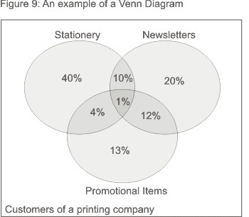
By separating out the proportions of the business' customers that buy each type of product, it becomes clear that the majority of the biggest group of customers (55% of the total) – those who have their company stationery printed – are only using Perfect Printing for stationery. It's possible that they don't realise that Perfect Printing could also print their company newsletters and promotional items. As a result, Perfect Printing should consider designing some marketing activity to promote these product lines to its stationery customers.
Customers who get their newsletters printed by Perfect Printing, on the other hand, seem to be well aware that the company also offers stationery printing and promotional items.
A Venn diagram is a great choice to use when you are trying to convey the amount of commonality or difference between distinct groups.
Key Points:
There are many chart and diagram formats you can choose from when representing information graphically. Selecting the right type starts with a good understanding of how each is created.
When you are clear about the specific sort of data the main types can be used to represent, you will be much more comfortable using the different types of chart in your analysis. This will add great value and improve the clarity and effectiveness of your communication.
ليست هناك تعليقات:
إرسال تعليق